
Brand guide · As of March 2026
Style guide
The most important rules for how nummix presents itself, at a glance. For everyone who writes about nummix, designs material or promotes a game night.

Colours
Blue, red, yellow and black are easy to tell apart, high in contrast and as accessible as possible. There are no other brand colours. We deliberately avoid shades of green so they are never mistaken for the game colours.
Use colour sparingly, to help people find their way. Text always needs enough contrast: at least 4.5:1 for body text and 3:1 for large headings.
Each colour stands for a theme
| Colour | Theme | On the website |
|---|---|---|
| Blue | Identity | The game, The idea, Story |
| Red | Design | Rules and style guide |
| Yellow | Communication | Join in, contact, tone and language |
| Black | Structure | Text, buttons, info boxes |
Why no green?
Red and green are the colours that people with red-green colour blindness mix up most often, and that affects about one in twelve men. In nummix, the colour of a tile decides which runs and groups it can belong to. That is why the four game colours, black, blue, yellow and red, are chosen so that they also differ in brightness, even without colour vision, and green does not appear in the game or the design. The only exception is pure decoration with no meaning, such as the colourful confetti at the end of the milestones.
Accessibility: contrast
Measured against WCAG 2.2, level AA. Text needs at least 4.5:1; large text (24 px and up, or 19 px bold and up) and important graphics need at least 3:1. Blue and yellow do not reach enough text contrast on white. That is why there are darker text versions for text in a brand colour. The brand colours themselves stay unchanged and are used for areas, graphics and tiles.
| Combination | Contrast | Use |
|---|---|---|
| Black #292929 on white | 14.6:1 | All text |
| Grey #5B5B59 on white | 6.8:1 | Secondary text, captions |
| Blue #36A9E1 on white | 2.7:1 | Areas and graphics only, no text |
| Blue text #1C75A6 on white | 5.1:1 | Links and text in blue |
| Red #E94E1B on white | 3.8:1 | Graphics and large, bold text |
| Red text #C63F12 on white | 5.1:1 | Small text in red, for example downloads |
| Yellow #F9B233 on white | 1.8:1 | Never for text, only areas and graphics |
| Yellow text #A36800 on white | 4.6:1 | Only if yellow text cannot be avoided, otherwise black |
| Black on yellow | 7.9:1 | Text on yellow areas |
| White on blue / red / yellow | 2.7 / 3.8 / 1.8:1 | Not for text; use black on coloured areas |
| White, blue or yellow on navy #11222C | ≥ 6.1:1 | Dark info boxes |
- Never rely on colour alone to carry information: always make game colours recognisable by number, shape or text as well.
- Blue and yellow numbers on the tiles get a thin outline in the text version on screen.
- Focus outlines in blue text colour, in white on dark areas. Form fields have a border of at least 3:1 (#767674).
Logo
The nummix logo is a combination mark made up of the word mark “nummix” and the symbol. The symbol shows four equal segments facing a shared centre: different people looking at the same playing field.
The primary logo is the preferred version. The secondary logo is just as valid and is meant for headers and narrow formats. The symbol on its own works for favicons, profile pictures and small markers.
- Minimum size, digital120 px wide
- Minimum size, print25 mm wide
- Clear space, combination markWidth of the “x”
- Clear space, symbol50 % of the height
- DPMA registration number30 2025 230 149





Please don’t
- use the word mark without the symbol (except in running text)
- change the shape, proportions or typeface
- distort, squash or rotate the logo
- ignore the clear space
- place the logo on busy or low-contrast backgrounds
- use colours outside the defined versions
Typography
Our house typeface for headings and body text. Designed so that every character is clearly distinguishable.
For accents: runs of numbers, technical terms, small highlights. 15–16–17–1–2
| Level | Weight | Size | Line height |
|---|---|---|---|
| H1 | Next Ultra Bold | 48 px | 1.2 |
| H2 | Next Semibold | 36 px | 1.25 |
| H3 | Next Semibold | 28 px | 1.3 |
| H4 | Next Semibold | 22 px | 1.35 |
| Body text | Next Regular | 16 px | 1.6 |
| Small text | Next Regular* | 14 px | 1.6 |
| Labels and UI | Next Medium | 14–16 px | 1.4 |
| Mono accents | Mono | 15–16 px | 1.5 |
* Accessibility: small text uses Regular instead of Light, because thin strokes are harder to read at 14 px. Line length 45–75 characters, no justified text, capitals used sparingly. Spacing: paragraph 16 px, heading to text 16–24 px, section to section 48–64 px.
Shapes
All patterns are derived from the symbol and use the brand colours. Diamonds and hearts may be rotated and scaled as long as their geometric structure stays intact. They break up large areas without covering any content.


Design elements
nummix wants to invite people, not impress them.

Dark box: for key messages. Triangle and diamonds in the colour of the theme.
Grey box for notes and key points.
Triangle before text: for lists and openings without a box.
Arrow box for calls to action.
German Patent and Trade Mark Office (DPMA) (external link)
External links in blue with a corner triangle, downloads in red with an arrow.
Pattern strips: dots, grid and dark speckles as calm dividers between sections.


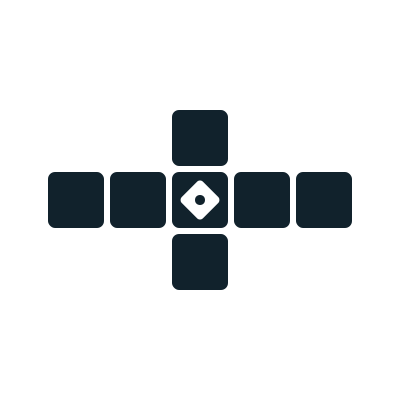
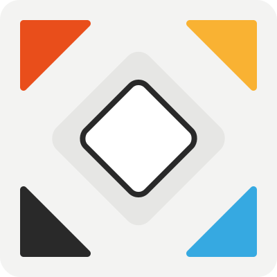
Hearts, cross and logo composition built from the shapes of the symbol.
Tiles
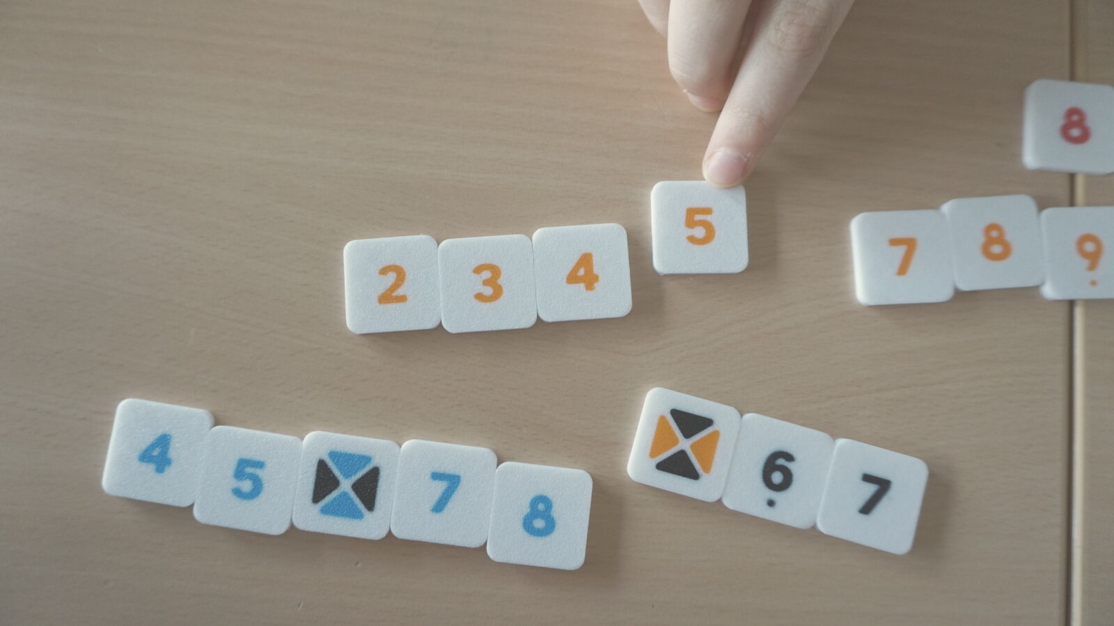
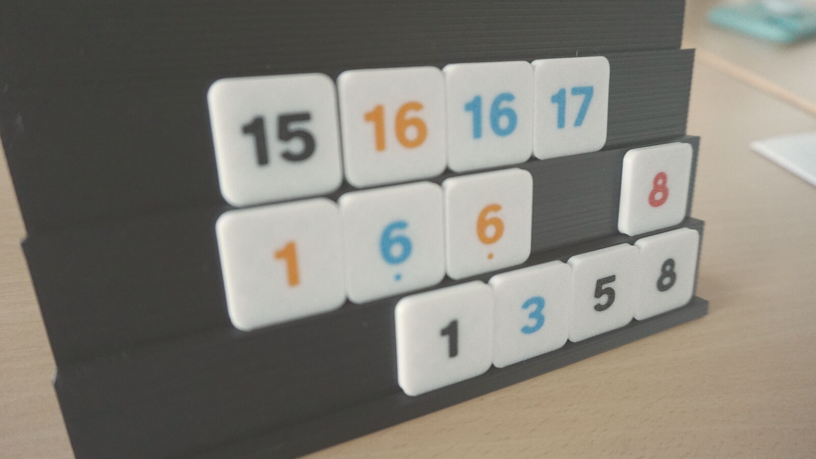
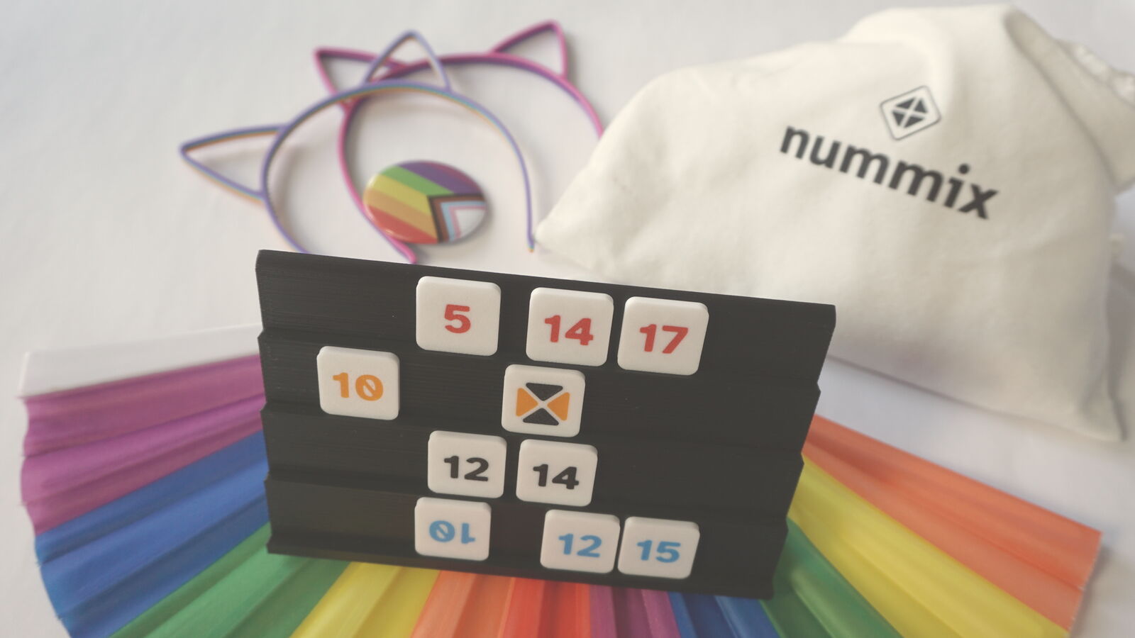
The tiles are square and white, with the number in the game colour. Jokers show four triangles pointing to the centre: top and bottom in one colour, left and right in the other. The tiles may be used as a graphic element and turned slightly.
Imagery
Photos show what the game is about: people playing together at a table. At the heart of it is the moment when everyone is focused on the same playing field.
The colours are light and warm. The pictures look tidy but not staged: game rounds at the table, hands and tiles, the playing field as a shared focus, product photos.
Instructions and rule graphics, on the other hand, stay technical: simple shapes, clear lines, calm layouts.
Tone & language
Tell it warmly. Explain it clearly.
The language of nummix is clear, easy to understand and welcoming. It stays approachable and open and avoids unnecessary jargon.
The technical voice
Explains the game system clearly and precisely, removes barriers and makes it possible for everyone to take part.
The human voice
Describes, with enthusiasm, what it is like to play and the encounters between people.
Questions about the brand or need more material? info@nummix.de